Sunday, 6 February 2011

Music Magazine First Design

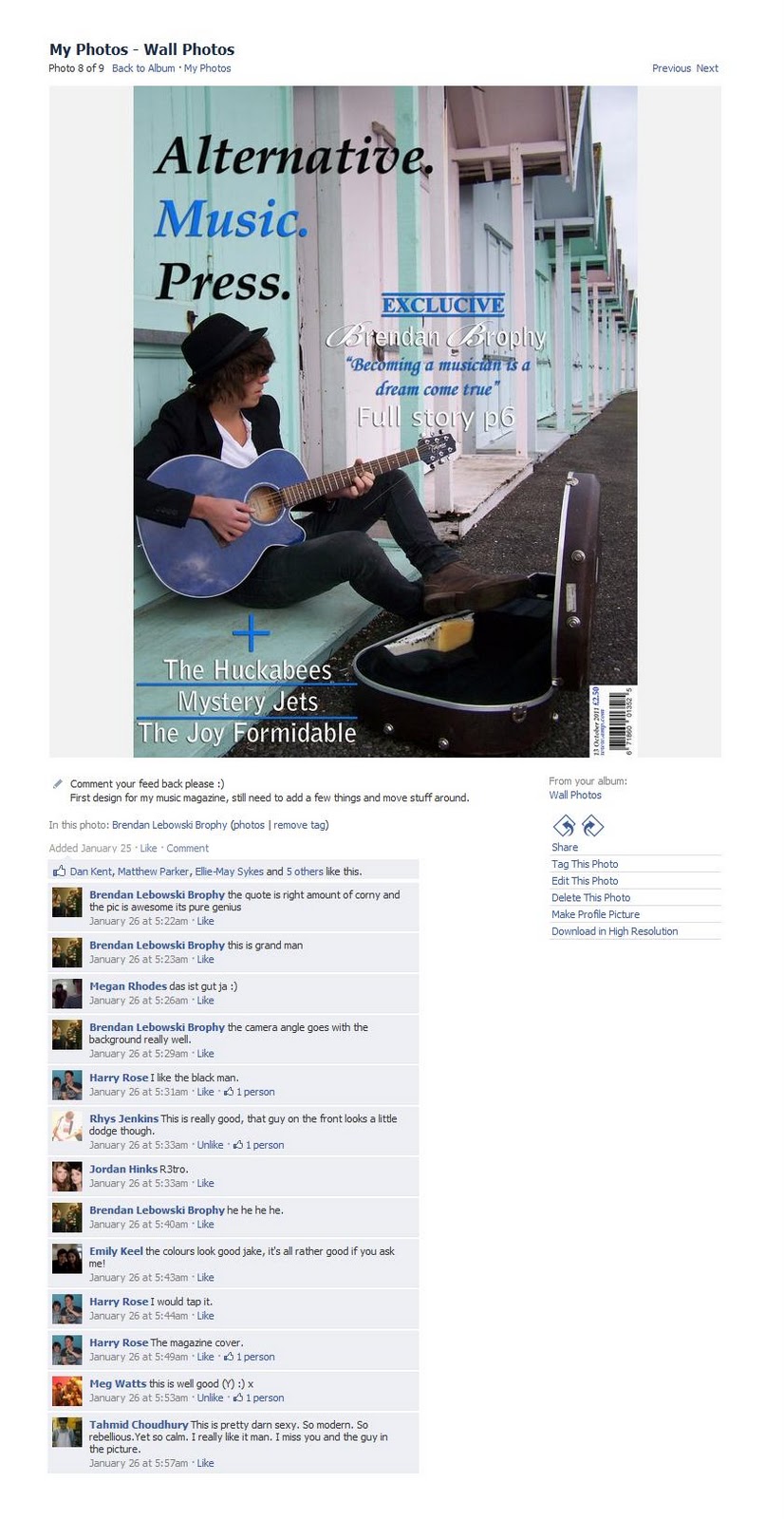
This is my first attempt at the front cover for my music magazine. I like the image I've used as it has space for my tag lines, title and extra information. Also the image is good as lines in the beach huts draw your eye to the centre of the image where the main article is. there is a few changes i will be making to my front cover to improve it, firstly I will move around the title and look at other fonts and colours as i've had feed back that the blue in the title doesn't stand out from the background as the beach huts have blue in them too, and also already published music magazines such as NME have a bold, recognisable title which I don't think mine is, so I will try and make it stand out and easily recognised.  


I posted the image of my front cover on my Facebook page to get feed back from my friends. All of them liked the front cover but not many of them put things that I could improve on so I had to go and ask people for there opinion and most of them seemed to agree with me that the title needed to stand out more and that I needed more tag lines. They also pointed out that the layout is good as everything is spaced out well and nothing covers the important parts of the main image.

Monday, 31 January 2011

Photo Shoot, January

In January I went out with my friend Brendan and took photos of him around Southsea with his guitar so I could get images for my magazine front cover. I've put my favourite two on here and have uploaded the rest to my Flickr account, http://www.flickr.com/photos/jakebooth-asmedia/

These two images are, what I think, the best two images for a front cover that I took on that day. They both have space at the top for a title and banner, if I wanted one. they also have lots of space along the right hand side for tag lines and also the images are of good quality. Having got feed back from my friends and media tutor I will go with the second image as my front cover main image, firstly because there is lots of room for tag lines, titles and other information and also because the image is more interesting and arty then the first one. further more in the first image the pose Brendan is pulling looks very unnatural which makes him look uncomfortable where as in the second image hes more relaxed which makes for a better picture. 

Music Magazine Title Ideas

The title of my magazine, I feel, should reflect the genre of music which will be represented. For example NME, New Musical Express, is a magazine about new up and coming bands and musicians, which from the title of the magazine you can tell. Also NME's name is a very formal name with how it’s laid out and the use of proper English which is quite old fashioned for a magazine as most magazines have adopted the casual every day talk into their title, this ‘old fashioned’ style of presenting the title can be seen as ‘retro’ which is a popular theme/style for the look of an indie/alternative magazine. 
I posted the six possible names I had come up with for my magazine, 'Alternative Music Press.', 'Alternative Music Broadcast.', 'The Alternative Press.', 'Live.', 'Live Music Press.', 'Backstage.' and asked my friends to comment there favourite.


Four people voted for 'Alternative Music Press', No one voted for 'Alternative Music Broadcast', 'The Alternative press' and 'Live.' got two votes, 'Live Music Press' got only one vote and 'Backstage' got eight votes. this feed back is good as I can get rid of the lowest voted names and keep the top two and decided  from them which one I will chose. The top two names were, 'Alternative Music Press' and 'Backstage'. Backstage is a good name as it suggests the magazine goes behind the scenes and can get exclusive information about bands and musicians, however the name doesn't suggest what genera of music my magazine is specialised in so if its not clear to the reader they might not buy it. Alternative Music Press, is also a good name as it clearly shows that genera of music the magazine will be about also it can be abbreviated to AMP which is also a word for an amplifier which is used a lot in the music world. having looked at both name my magazine will be called 'Alternative Music Press' as with this name I can do many things and create a title that will stand out and be recognised.  


Tuesday, 25 January 2011

Music Magazine Proposal


The genre of my magazine will be Alternative/Indie. I chose this genre because these were the two most popular genres chosen in my audience research questionnaire which proves that this is a popular genre and that there will be people to buy it. This is also a good genre for me as it is also my favorite type of music and this will help me create a popular and successful magazine based on this genre.
The target audience of my magazine will be male and females that like alternative music, which I think will be mainly between the 14 and 24 as this is the main age that attend gigs and follow bands to the extent of buying a magazine to read about them, also this age because this is the age when people generally have money to spend on items such as magazines.  
The title of my magazine should represent the genre of music that will be in my magazine. As my magazine will be about new indie, alternative bands and musicians my name should clearly state that that is what will be in this magazine. Having looked through many issues of NME I have a few ideas of what images I would like for my front cover contents page and the double page spread. My front cover and double page will have the same musician or band in the images as I will link the two pages, the contents page will have around 5/6 other images of gigs and other musicians to make the contents page more interesting and more professional. The fonts I will use will be clear and modern but also retro and interesting and a combination of these are used in NME and I think it looks more interesting then just one type of font and if it looks good on there magazines it should look good on mine.

NME Front Cover
NME Contents Page


I have looked at NME photos on their website, http://www.nme.com/photos , to get ideas on how my images could look and ideas for settings.  Also before I go and take my images I will research how to take professional looking photographs to make my magazine look the best I can

My double page spread will be about the musician on the front cover. I’ve seen a few double page spreads that I like from NME and they all have a large main image and writing along one side with quotes picked out from the musician made bigger to stand out, my double page spread will be along the same lines as this.

NME Double Page Spread 

NME Double Page Spread

 I like the first double page spread with the image taking up the whole space and the writing on top as it looks more flowing and interesting to look at, as the second double page spread the writing on the blank background looks very boring and almost news paper like. 

Monday, 10 January 2011

Lesson Overview Monday, January 10 2011

In todays lesson I uploaded the conclusion to my Student College Magazine Project, I completed and uploaded two front cover deconstructions of the magazine 'NME', and I have also written up my audience research questionnaire and will give them out over the week for people to fill out. Finally I have started on my planning on titles and music industry analysis which I will complete and upload at home, also at home I will take photographs that I can use for my front cover, contents page and double page spread. 

NME Front Cover Deconstructions